2014-2018 https://wellpad.org, https://canpad.ca, https://wellpad.io
NOTE: “patient” names are completely fictitious unless redacted
Project Background
Wellpad was a tablet-based survey tool already in clinical use when I joined the project, and I was tasked with pulling and analyzing data “stuck” inside.
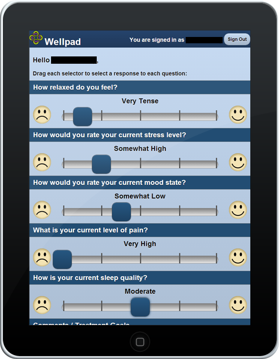
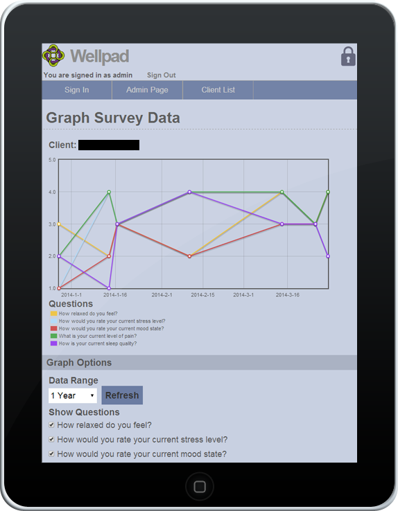
The first attempt at visualizing this data was presented at MobileHCI. Improvements to the tool were also requested, upon the assumption it could be commercialized eventually.
Analysis
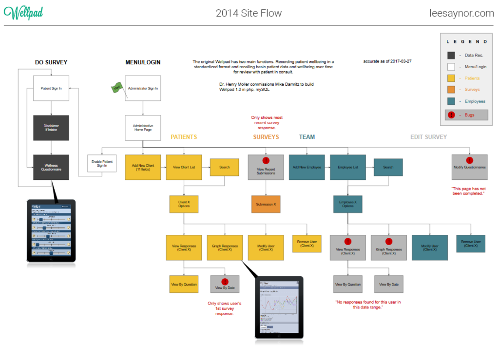
The functionality of the existing tool was tested and visualized.
UI Reskin
My proposal did start with a “re-skin” of the existing interface with the clinic‘s developing colour scheme…
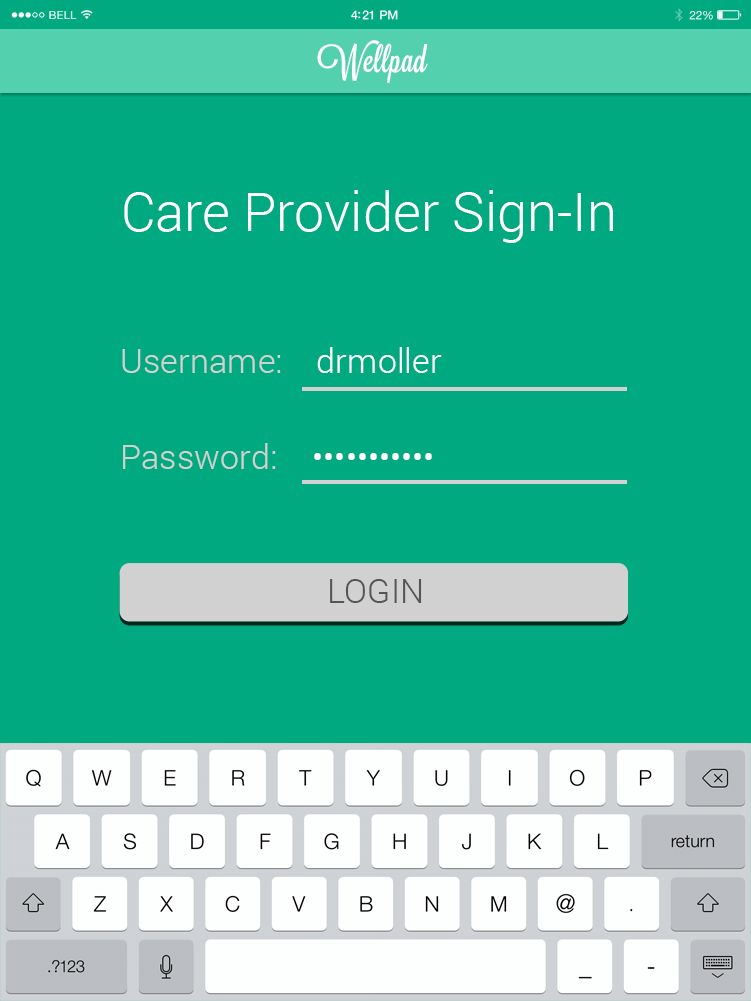
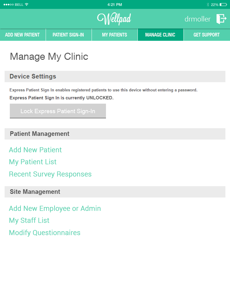
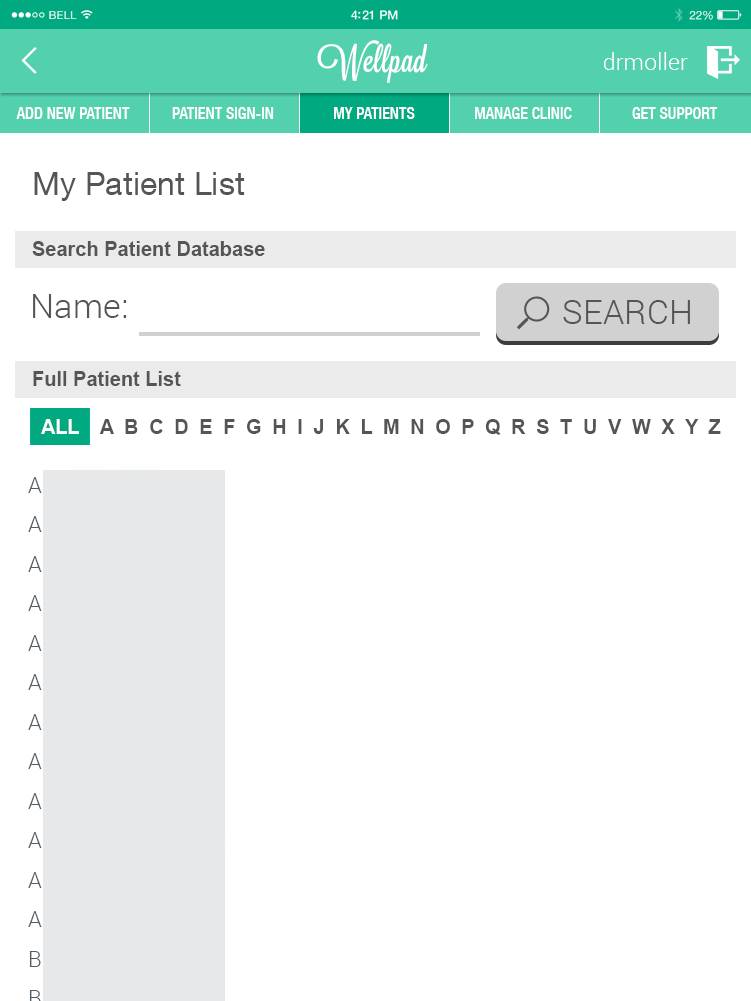
…But it was argued by developers a new framework was necessary to make the product saleable/scalable, so, go wild.
UI Redesign
This led me to design a significantly more graphical user interface in 2016 which would:
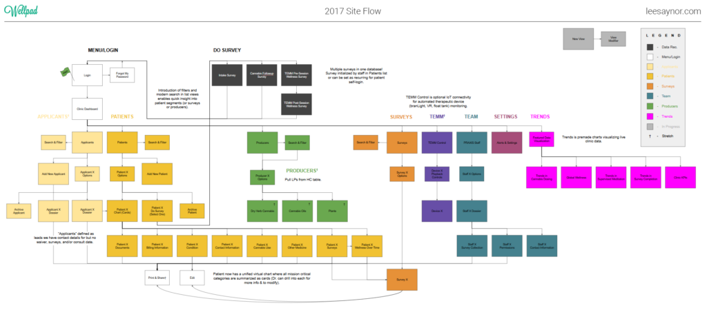
- unite two treatment databases into one (medical cannabis + modular meditation program) with room for more (other methods of care or medications)
- surface/visualize data collected digitally but largely hidden to the care provider (preferred varieties, dosage)
- digitize/visualize data collected but buried in paper (license status, pain drawing, other medications, current meditation module)
- enable customization or at least choice of patient surveys by the care provider


Tapping “Explore Trends in Cannabis Dosing” would provide more detail and the ability to set a target.

The ability to recall and filter patients by more than just name (eg. condition, treatments, clinical status, etc.) was explored. This would make it possible to compare groups broadly and individual members of groups to one another, in-app and at a glance.
A confusing and broken questionnaire response section (orphaned from client condition info) would be upgraded to a more holistic Patient Profile more readily answering questions like “how is this patient doing…in relation to before?”, “where are they in their treatment(s)?”, “who are they registered with…for how much…and for how much longer?”, and “where does it hurt?”


The patient list would be repurposed for Licensed Producers, containing products patients were already referencing when asked to list preferred varieties.
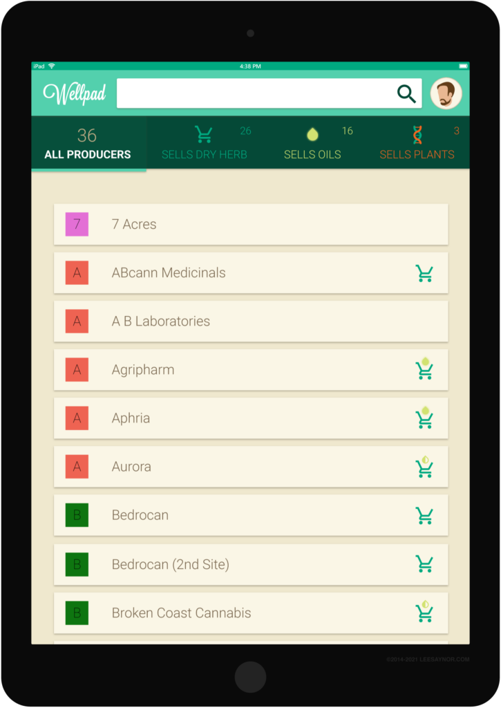
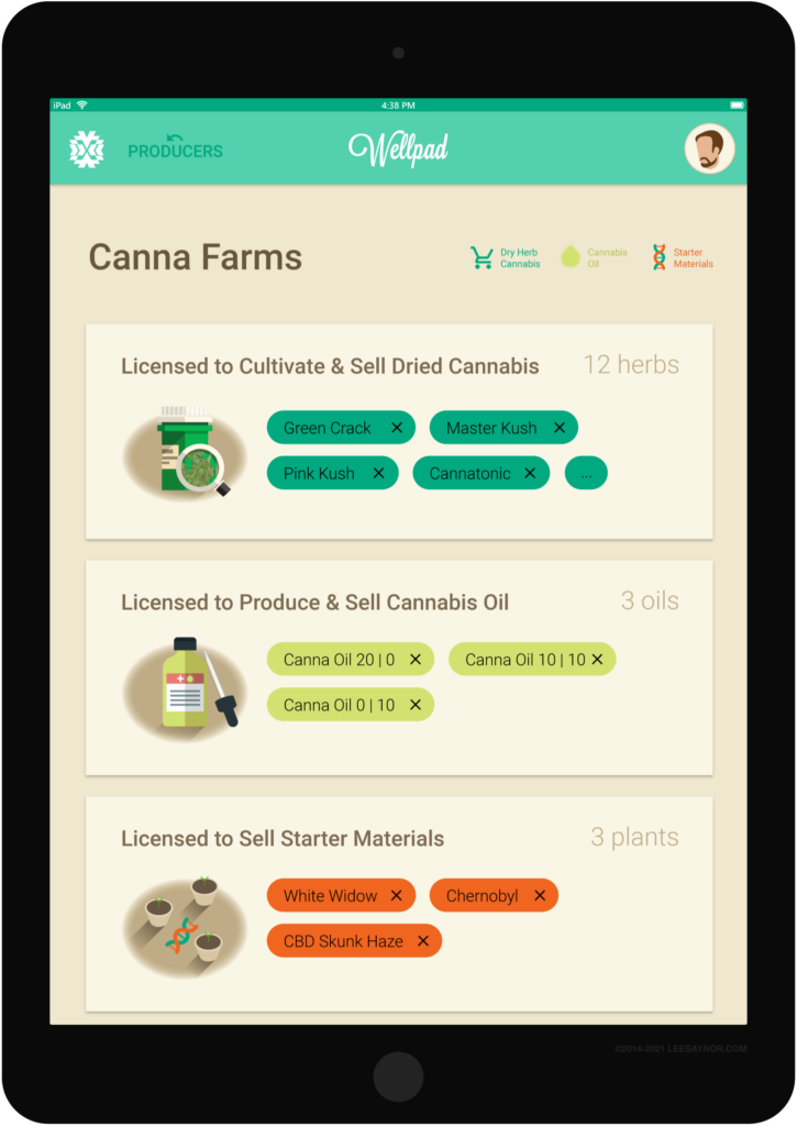
Below is an updated visualization of the redesign.
Reflection
What I liked: improved “virtual chart” always current with data (incl. important deadlines which could easily become alerts), featuring patient sentiment prominently, elements are touch/tablet size
Needs Improvement: visual consistency incl. text and clipart, novice process (I did user flows but not paper mockups/wireframes…expect to see this in newer projects), novice project management