The Office for Creative Research (OCR) is building the data visualizations of the future: functional, responsive, beautiful, and human. Their projects challenge conventions and trends within the field, and power and politics more broadly. Jer hopes that by tying their practices together, they can make things that have more of a footprint. They are also hoping to provide an example of a non-profit with 18 salaried people. We visited OCR’s unassuming loft in Chinatown; it felt like when Neo went to see the Oracle.
“The caveat of data is that it always surprises you and gives you something you didn’t expect. And those are the good things you want to build the product around.” -Jer Thorp
Specimen Box
Microsoft’s Digital Crimes Unit (DCU) challenged OCR to make a data visualization toolkit they would be using in 5 years that they could never imagine themselves. DCU has three interests: preventing software piracy, stopping child pornography, and botnets (OCR’s focus with them.)
DCU wanted to better understand and respond to botnets, swarms of “zombie” machines used to send email spam, steal data and passwords, mine bitcoins, attack other machines through denial-of-service (DDOS), or install ransomware (malicious software that blocks you from using your computer with a paywall.) In my work for Dell technical support at the height of the Koobface worm, Malwarebytes uncovered scads of malware associated with botnets, commonly because the user had not implemented preventative security and/or were tricked through social media links or phony program updates/installs. Although a sluggish or strangely behaving computer could be cause for concern, increasingly, botnet developers are targeting network accessories and appliances, which have lower security and rudimentary user interfaces.
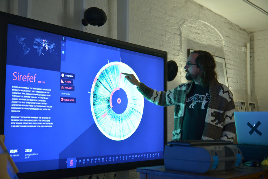
We are looking at 13 bubbles pinned to an indigo background on a 82″ Microsoft Perceptive Pixel touch display. Each botnet has a name, like Bamital, Citadel, or Sirefef. Sometimes a botnet’s name alludes to its character (chatty vs. stealthy) or a black market purchaser may specify a name of their choosing much like a vanity license plate. These are botnets which have been “decapitated” by DCU for research, although Microsoft could use Specimen Box to better snoop control nodes before this.
Jer says that when about when 80% of Citadel was decapitated, DCU started receiving “white flag” text strings from the operators. Because the DCU collaborates with the FBI and Interpol, often the next event is a police raid of the operators’ premises. “We really wanted to go along on one of their takedowns.” Jer jokes, “I wanted to put on the vest! I’m sure it’d be really unsatisfying… they break down the door and there’d just be, like… a dude in a basement.” Maybe even next door. You can usually find articles about defunct botnets’ operators (and how the malware propagated), like this exposé by Sophos about the aforementioned “Koobface malware gang” (PDF).
Show All The Data
Hiding data is reductionist by nature, inherently making the data visualization less useful. Smart design is transparent without being cluttered, enhancing human pattern recognition.
Each point of light entering a bubble represents 10 calls “home” to the botnet’s control node. There is a pulse at every 2500 messages, and at every 35,000, a vocoder announces the city of origin to stress the globality of each botnet.
In the snapshot of Sirefef shown up top, 80.9k infected machines are calling home about 220 times per day. Each slice of the iris is one machine, with its calls as points of light radiating outwards. Certain machine types can have telltale patterns, but the twisted darkness near the inside and outside of the donut is night, when many put their devices to sleep.
Comparison is also vital to understanding the data. One can spit the iris into two for a date comparison, or flick upwards into a 3D topographical intensity map. The first thing OCR was able to show Microsoft was a strip of missing data, an error in their recording.
Sonification & Visual Beauty
The audiovisual polish of Specimen Box is nothing short of stunning: the microbial globules remind me of Osmos and their choir is alien and futuristic. The metallurgical yawn of the radar arm sweeping over the fine grain data is not just for cool factor, intended to produce surprises and patterns which might only be audible to analysts. Sonification can be very useful to changing your thinking pattern about the dataset. For example, a particular soundscape may tease out machine purpose, or where the botnet is more active, geographically.
This reminds me of geographically-unique tunnel acoustics and the rumour that the earliest Victorian sewers were designed by instrument makers. Ben Rubin designed the sonification of Specimen Box. The first iteration was “too cheerful,” but then they made it “too dark” (“like German Industrial music”), before they arrived at “just right.”
Jer believes visualizations can not only enable better data analysis for researchers, but also communicate they’re doing to a wider audience, attracting interest and funding. Jer realized this in Vancouver when helping his scientist friend who was doing H1N1 research and was underfunded.
In Canada’s downhill regulatory climate, appealing interactive data visualizations could help reinvigorate fundamental research (otherwise known as “basic science” or “discovery science,” that has no “immediate commercial benefit.”) In a new post on CMAJ, Christopher Webster explains how the feds are violating the Canadian Institutes of Health Research (CIHR)’s mandate. A large part of the organization is being restructured into a business incubator while its budget is being slashed (at least 25% since 2009), at the expense of “[dropping] about 60% of the basic researchers out in the cold.” Yes, we should fund and incubate biotech. No, we should not cut fundamental research. It is hurting Canada.
Find Your Theme
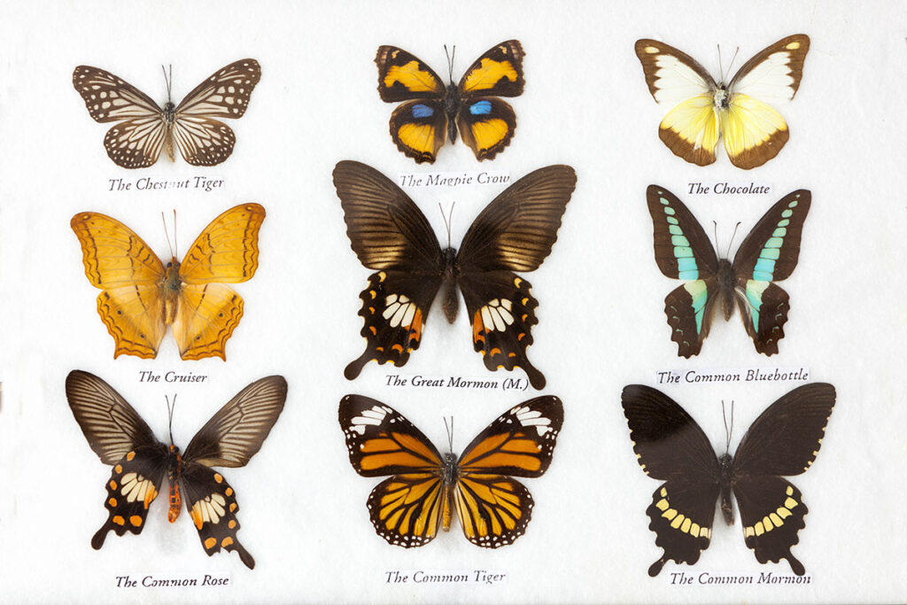
Specimen Box was imagined as an alien’s pinned butterfly collection. Much of the original skeuomorphism was abandoned, but the metaphor persists. OCR usually finds a theme to design around.

“When starting a project, is there a visual or conceptual metaphor that you can build on? A lot of these projects are inherently abstract. Without something as a scaffolding, you kind of end up with something that doesn’t feel complete or take you anywhere,” says Jer, “Are there pieces of fiction that talk about related things that we can bring in? Are there films or cultural artifacts? It’s not obvious to anybody, but ends up making a more solid project.”
MoMA Catalog Performance
OCR was asked to do a residency at MoMA to create something interesting with their catalog of works, which contains about 148,000 items. They wanted to do justice to an amazing, meaningful collection of history, artists, and objects. Jer says this meant eschewing rote comparison visualizations (object dimensions, geomapping) and curatorial connections in favor of asking different kinds of questions of the data.
Initially, OCR queried every piece containing the word “child” in its title, in order of increasing length. The system uses synonyms to prevent getting stuck, outputting an indiscriminate, trans-media, intergenerational thematic pyramid of every piece that was given a title relating to children. A separate query about “fuck” illuminates the vulgarity of the art world. Jer describes these queries functionally as “the entire collection at a party, free to mingle.”
The Elevator Repair Service theatre group is famous for “performing the unperformable.” (eg. Gatz, a 6-hour performance of The Great Gatsby book split by a dinner and two breaks.) Jer had been working with them for a couple years and knew they would be ideal for this project. In their 2014 test performance at MoMA, a man alphabetically calls out the first names of all the male artists in the MoMA’s collection, as flocks of them fly by on a screen overhead (eg. 200 Johns, 162 Roberts, etc.) Every once in a while, a woman will try to “get in” to the art world with a few female artists that share that first name.
What Performance Adds
Part of it is simply finding new and unexpected methods of engaging the public says Jer, “Generally, people associate the word ‘data’ with the word ‘boring.’ We want to change that because it allows us to have better conversations, and think more broadly about possibilities of data.”
Collaborating with actors also adds a new, competitive layer to computer data projects, which can be used as a great project shakeup. It’s easy to say a statistic, plot a pie chart, but in the case of the MoMA test, performance does something more personal with names. “What would happen if we took this data and had people reading it, moving, interacting with one another? Does that allow us to understand data in a different way?” asks Jer.
OCR would like to do this kind of data visualization performance with other institutions, but most are extremely protective. The piece being accessioned would probably help, but Jer says he’s not holding his breath because the documentation was a bit rushed. He jokes about how awesomely circular it would be, to have a piece about the MoMA’s accession catalog inside of itself.
Floodwatch Chrome Extension
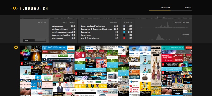
What large and unknowable data systems are intersecting with our lives? Floodwatch is an activist tool that intends to shine some light on how the notoriously secretive Internet ad industry profiles you and adjusts your bubble accordingly.

This Chrome extension silently captures the ads you see, then serves them back to you in a composite view. Although this is the most raw encapsulation of what advertisers think about you, there are other analytics built in, with the option to donate your ad data to research groups focused on electronics rights.
For instance, ad companies know if you’re a student, in Toronto, that buys coffee, and rides a bike. A bike company would pay a bit more money for you, even more if you were shopping for one recently. However, a sports car company would pay top dollar to get their ad in front of your dad who bought a Ferrari a few years ago.
I’ve had the occasional web developer friend chastise me for using AdBlock, but straight up, I can’t concentrate on what I’m doing. I’m not even talking about seizure-inducing ads, but these 2+ minute HD videos of slow-motion food and people hula-hooping, interspersed by some lady talking about diets; or when sloppy coding causes ads to be fused on top of the article itself. I do however support Acceptable Ads.
Open & Ethical
Jer describes his team as ethically rigorous, anti-consumerist, and anti-brand, but admits they cannot be effective at any of this without working with larger companies. He feels there isn’t a clear place to do what they want while being sustainable in academia, the agency world, or as practicing artists.
“This sounds like a really trite thing to say, but we also want to affect change. We want to do things that are changing the way everyone thinks about data, including the actual politics of it,” says Jer, “We want to be open sourcing our technology to allow people to do things differently.”
On sustainability, Jer praises organizations like New Museum’s NEW INC, “the first museum-led incubator,” for launching businesses from the art space “without becoming silicon valley monsters.” In addition to monthly OCR Fridays meetups, Jer is also one of the founders of Eyeo Festival, which looks like an amazing conference of creative coding and data enthusiasts. OCR is also preparing to release a journal this summer, “a weird collection of thinking, artifacts, code, and things that come from our projects.”
Teamwork & Workflow
In 1999, Jer started in field of generative art, but felt it was a bit of a dead end. He talks about a project he was working on: a “colour economy” of pixels trading colour with another to simulate complex systems. It would inevitably collapse though, because randomness is not what you want; rather semi-structured things. His work at the New York Times Research & Development Group (NYT R&D) on a publicly searchable stock market API was an attempt at investigating the border between data and cultural relevance.
When asked about expertise on the team, Jer responds that everyone at OCR is very multidisciplinary (eg. coder Noah has an architecture background, others come from performance or video art.) To remain flexible and adaptive, they often test new hires by putting them on a project they are unfamiliar with. “We need people who can switch gears,” says Jer. The day prior to our visit, their new Director of Projects, Kate, covered an absurdly long list. “And now this next project… is about sending an expedition into Africa. Now this next one…”
Everyone should become proficient in something, you have to do it to become proficient at something else, but the number one skill is to do things quickly. And for this, you need to do it a lot, as much as you can.
A project like Specimen Box took four people four months to build a polished prototype that works, but probably isn’t ready for the public. Matt brought up that Noah Feehan told us the day before, “You shouldn’t suffer for more than half an hour.” Thorp responds, “But you should suffer for that half an hour. Totally.”
In summary, the core of what OCR is doing is thinking through making. Michael Zimlis who started NYT R&D was a big advocate of this. On why traditional design companies can be unsuccessful with data, Jer says, “Data is not something that lets you be speculative. You inherently can’t understand data until you can actually play with it and work with it.” In other words, you can hire OCR to write a white paper, but they will always build something first.
Lee Saynor is a Digital Futures undergrad at OCAD University. The keystone of Atelier II – Collaboration was a week-long field trip in New York City, where the class visited some of the most important people and organizations in creative technology. Thank you Jer and everyone else at OCR!
Leave a Reply